Square Poseidon
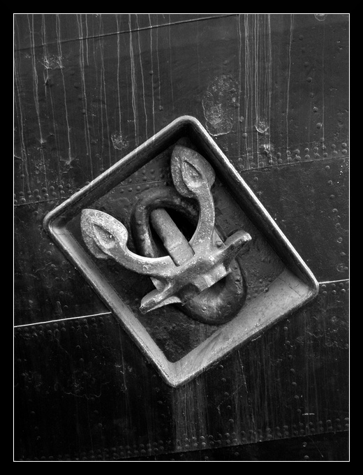
Ok, it's not really a square, but it comes near... :-)
I hope, the central composition is appropriate here.
I also think, the slightly ascending parallel lines through the picture add some dynamics, as well as the upwards pointing "arrows".
Additionally the white border, as it continues the white line through the picture, does the job of "anchoring" :-) the central part.
Finally I like the water stains, which add some detail and make the picture more interesting, without too much distraction. They are also the only lines in the image which don't run in some angle - this way they also show, that it is in fact the (natural) horizontal view - I didn't rotate the image.
But perhaps I also think too much about the details :-)
Hope you just like it!
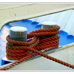
You may also want to have a look at my other harbour-motive:

Hold Me Tight
Timm Pieper


Martin Unger 07/06/2006 23:03
Good motif, and also here you succeeded with your presentation!Just some details which I might have done different: BW is very suitable for this, but maybe you could add alittle bit more contrast. I might also have rotated the picture a little, having the rivets in a square angle. By this underlining the geometric forms, "disturbed" by the natural staining.
I don't know if the picture would be better, but I think it might be worth a thought...
Though as I said, I like this picture as it is now too!
Regards, Martin