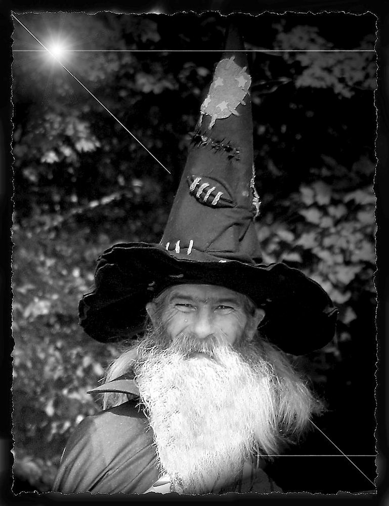
The Wizard in Black and white.
I posted this earlier in Color and someone commented about it being black and white. So I thought I would put it here and get your opinion. I like it both ways, but have to admit..that black and white does bring more focus to his face and the lines there.
Thanks for your thoughts ahead of time.


KasiaDesign 08/10/2006 15:29
b&w is more effective than the colourThe Wizard, or is he?
Dianna TilleyBut I feel his face is so expressive - well seen ! - that you don't need the effects and the frame.
One tip for portrait pics is not to use the full 1000 pixels in height. The shot is too long for most monitors and the viewer does not get an overall view or feel. Here you just see the starbust and the hat and need to scroll down to see more.
I usually go for 700 or 800 pixels .
But maybe Ruud or Dirk have a better idea?
Cheers, Kathryn
Dianna Tilley 08/10/2006 15:00
Thank you Ruud, I appreciate your honesty and that is why I put it here. Your right about the beard.